"ggplot" - The Art Of Visuals
How to confuse your audience with charts and graphs😂


I'm sure you might be wondering what I'm trying to say here 😂. But trust me, data visualization can be a powerful tool that can either deceive or mislead people. However, it's important to note that when used effectively, data visualization can also be used to clearly and concisely communicate complex information.
INTRODUCTION
Data visualization is an essential part of presenting information. Among various tools available, one package that stands out in the world of data visualization is ggplot. Created by Hadley Wickham, ggplot is a versatile and elegant package in the R programming language that has revolutionized the way we create and appreciate data visuals. In this exploration, we delve into ggplot, discovering the art of creating stunning data visuals.
I'm guessing you're waiting for the mathematical aspect😂 As always, I have one. Let's take a look at this Bearing and Distance example below.
Before we look at a problem let us understand what Bearing means

Bearing is the invisible thread that connects two points in space,
spinning the world around us. (What is this right? 😂 That's my definition)

Question:
A boat sails 6km from port X on a bearing of 065 degrees and thereafter 13km on a bearing of 136 degrees.
What is the distance and bearing of the boat from X?

Solution
First, we need to understand what the question is saying before we start
interpreting.
Take your pencil and draw a point X, take a ruler and rule a straight line
to another point Y and rule another straight line to point Z
and finally, close it up at point X again and label each angle to their points

Check out this diagram below:
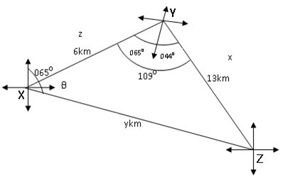
So, after drawing my diagram from the question I move on to solve
By using the cosine rule to get my distance, and then the sine rule to get the bearing.

Cosine Rule says that;
b^2 = a^2 + c^2 – 2ac(CosB)
So, we have to replace a, b, c, and B with x, y, z, and Y respectively;
y^2 = x^2 + z^2 – 2xz(CosY)
y^2 = 13^2 + 6^2 - 2(13)(6)(Cos 109 degree)
y^2 = 169 + 36 – 156(- 0.3256)
y^2 = 205 + 156 x 0.3256
y^2 = 205 + 50.7886
y^2 = 255.7886
Then, we square root of both sides
y = 16km to the nearest km (Our Distance from the question)

So, to find the bearing of the boat from X
we will use the Sine Rule which says;
Sin(x)/x = Sin(y)/y

inserting the values we have,
Sin theta / 13 = Sin 109 degree/16

Cross multiply we would have
16 * Sin theta = 13 * Sin 109
16 * Sin theta = 13 * 0.9455
16 * Sin theta = 12.2917

Then, we divide both sides by 16
Sin theta = 12.2917/16
Sin theta = 0.7682

Take the inverse of Sin
theta = Sin^-1(0.7682)
theta = 50 degrees to the nearest degree

Therefore the bearing of the boat from the port will be 065 degrees + 50 degrees

065 + 050 = 115 degrees
Looking at the question or my answer, you may be wondering how it relates to data analysis. However, I chose to talk about bearing because it is also relevant to the process of data analysis. Just as in bearing, where I had to understand my question, process it, and analyze the data to create a diagram, data visualization also involves understanding and analyzing data to create informative visualizations for stakeholders. By doing so, you can identify areas for improvement or investment in your business to increase profits and sales😎

The origin story of ggplot is an interesting one.
The acronym "ggplot" stands for "Grammar of Graphics." The concept behind ggplot is that there should be a consistent and organized method for constructing and understanding visualizations. Initially created as an R package in 2005, ggplot has become an integral part of data visualization within the R ecosystem. The fundamental strength of ggplot lies in its ability to present elaborate data as visually appealing and easily understandable graphics using structured grammar.
The Grammar of Graphics
The core philosophy behind ggplot is to use the "Grammar of Graphics" system to break down the process of creating data visualizations into discrete, understandable components. This grammar consists of a set of building blocks that can be combined to construct a wide range of visualizations. The essential elements of the Grammar of Graphics include:
Data: The raw dataset that provides the information to be visualized.
Aesthetic Mappings: The relationships between data variables and visual properties, such as mapping a variable to the x-axis or color.
Geometric Objects (Geoms): The geometric shapes used to represent data points, such as points, lines, bars, or areas.
Statistical Transformations (Stats): The calculations applied to the data to summarize or transform it before visualization.
Faceting: The process of creating multiple plots, each showing a different subset of the data.
Themes: The overall look and feel of the visualization, including fonts, colors, and grid lines.
ggplot allows users to create precise and flexible visualizations, elevating charting into an art form.
Mastering ggplot: A Journey of Artistry
Creating visually pleasing plots using ggplot can be compared to the work of a painter who skillfully uses a palette of colors. Every layer, also known as "geom," that is added to a ggplot visualization adds depth and meaning to the final plot. Here is a brief overview of the process of mastering ggplot with a dataset as an example:
- Understanding the Data
The first step in creating a ggplot visualization is to thoroughly understand your data. This includes exploring data distributions, identifying trends, and selecting appropriate variables for visual encoding.
# Loading necessary libraries
library(ggplot2)
library(dplyr)

# Loading the dataset
arbuthnot_data <- read.csv("arbuthnot.csv")

# View the first few rows of the arbuthnot_dataset
head(arbuthnot_data)

# Summary statistics of the dataset
summary(arbuthnot_data)
- Choosing the Aesthetics
The choice of aesthetics in ggplot is crucial. Mapping variables to aesthetics like color, size, and shape can convey multiple dimensions of data in a single plot. Thoughtful aesthetic choices can transform mundane data into captivating visuals.
#Creating a Time series plot of births over the years

# Using ggplot to create a new plot using the arbuthnot_data dataset
ggplot(arbuthnot_data, aes(x = year)) +

  # Adding a line layer for boys' birth data
  geom_line(aes(y = boys, color = "Boys"), size = 1) +

  # Adding another line layer for girls' birth data
  geom_line(aes(y = girls, color = "Girls"), size = 1) +

  # Adding labels and titles to the plot
  labs(title = "Births in London (1629-1710)",  # Setting the plot title
       x = "Year",                             # Setting the x-axis label
       y = "Number of Births") +               # Setting the y-axis label

  # Customizing the colors of the lines for boys and girls
  scale_color_manual(values = c("Boys" = "blue", "Girls" = "pink")) +

  # Applying a minimal theme to the plot for a clean look
  theme_minimal()

- Selecting Geometric Objects
The choice of visualization type in your data analysis depends on the nature of your data and the story you want to convey. There are various types of visualizations, such as scatter plots, bar charts, and line plots, to name a few. Picking the right visualization type is like choosing the best brushstroke to bring your creative vision to life.
# Creating a histogram of the birth ratio distribution

# Using ggplot to create a new plot using the arbuthnot_data dataset
ggplot(arbuthnot_data, aes(x = birth_ratio)) +

  # Adding a histogram layer to visualize the distribution of birth ratios
  geom_histogram(fill = "blue", bins = 20) +

  # Adding labels and titles to the plot
  labs(title = "Distribution of Birth Ratio in London (1629-1710)",  # Setting the plot title
       x = "Birth Ratio (Boys / Girls)",                           # Setting the x-axis label
       y = "Frequency") +                                          # Setting the y-axis label

  # Applying a minimal theme to the plot for a clean look
  theme_minimal()

- Applying Statistical Transformations
ggplot's stats provide data aggregation and smoothing for better visualization.
# Creating a Bar chart of the average birth ratio over the years

# Calculating the birth ratio by dividing the number of boys by the number of girls for each year
arbuthnot_data <- arbuthnot_data %>%
  mutate(birth_ratio = boys / girls)

# Using ggplot to create a new plot using the updated arbuthnot_data dataset
ggplot(arbuthnot_data, aes(x = year, y = birth_ratio)) +

  # Adding a bar layer with bars representing the average birth ratio
  geom_bar(stat = "identity", fill = "blue") +

  # Adding labels and titles to the plot
  labs(title = "Average Birth Ratio in London (1629-1710)",  # Setting the plot title
       x = "Year",                                           # Setting the x-axis label
       y = "Average Birth Ratio (Boys / Girls)") +           # Setting the y-axis label

  # Applying a minimal theme to the plot for a clean look
  theme_minimal()

- Faceting for Complexity
Faceting can be a powerful tool to add depth and context to complex data visualizations by creating multiple small plots that focus on different facets of the data.
Creating a Faceted Time Series Plots

# Creating a new column 'gender' for facetting
arbuthnot_data <- arbuthnot_data %>%
  mutate(gender = ifelse(boys > girls, "Boys", "Girls"))

# Using ggplot to create a new plot using the arbuthnot_data dataset
ggplot(arbuthnot_data, aes(x = year)) +

  # Creating separate lines for boys and girls based on the 'gender' column
  geom_line(aes(y = boys, color = "Boys"), size = 1) +
  geom_line(aes(y = girls, color = "Girls"), size = 1) +

  # Facetting the plots by 'gender'
  facet_wrap(~gender, ncol = 1) +

  # Adding labels and titles to the plot
  labs(title = "Births in London (1629-1710)",
       x = "Year",
       y = "Number of Births") +

  # Customizing the colors of the lines for boys and girls
  scale_color_manual(values = c("Boys" = "blue", "Girls" = "pink")) +

  # Applying a minimal theme to the plot for a clean look
  theme_minimal()
- Fine-Tuning with Themes
Customize aesthetics with ggplot themes for extraordinary visuals.
# Creating a Dark-themed Histogram

# Using ggplot to create a new plot using the arbuthnot_data dataset
ggplot(arbuthnot_data, aes(x = birth_ratio)) +

  # Adding a histogram layer to visualize the distribution of birth ratios
  geom_histogram(fill = "blue", bins = 20) +

  # Adding labels and titles to the plot
  labs(title = "Distribution of Birth Ratio in London (1629-1710)",
       x = "Birth Ratio (Boys / Girls)",
       y = "Frequency") +

  # Applying a dark theme with white text and gridlines
  theme_dark() +
  theme(plot.title = element_text(color = "white"),
        axis.text = element_text(color = "white"),
        panel.grid.major = element_blank(),
        panel. grid.minor = element_blank(),
        panel.background = element_rect(fill = "black"))

The Legacy of ggplot
Over the years, ggplot has become an indispensable tool in the data science and visualization community. Its elegant and systematic approach to data visualization has not only made creating graphics more accessible but has also elevated data visualization to an art form. ggplot has inspired countless data enthusiasts to craft visuals that communicate data stories with clarity and beauty.

CONCLUSION
To sum up, ggplot, the art of visualizations, has revolutionized the way we explore and convey data. Its Grammar of Graphics provides a systematic framework for building data visualizations that are both informative and aesthetically pleasing. By mastering ggplot, we can unleash the potential of data visualization, which enables us to create compelling data-driven stories that captivate and inform audiences worldwide.

In my upcoming article, I will explore statistical analysis to help us understand statistical packages to aid analysis✨
I would greatly appreciate your support in sharing and liking this article. It will help to spread the message and reach a wider audience, which is important. Thank you for contributing to this cause🎉
Let’s Connect
Reach out to me on Linkedin
Reach out to me on the X app ( Kindly follow I'll follow back immediately )
“Cover photo” ―Postermywall
“GIF” ―Giphy